Marshmallow App
Scaling offering & Reducing cost to serve
Scaling Marshmallows in app core product offerings to help reduce cost to serve and drive engagement of core new features

Overview
Marshmallow focuses on delivering best in class customer experience through their insurance app. All initiatives are focused on app first engagement due to higher retention opportunities.
Over the last 12 months I have led the product strategy for a range of initiatives across product squads in order to scale up our product offering. We currently have one of the highest app/play store ratings in insurance sitting at 4.8/5 stars. The following projects demonstrate core initiatives we have delivered over the last year.
Role
- Strategy lead
- Product design
- Product management
- User research
Duration
12 months
The background
There were a host of new projects that were planned across our product squads which cover claims, retention, growth and risk mitigation. However there was no consistent oversight of the how these would holistically be managed across our end to end customer experience. We initially aimed to setup foundational initiatives and workflows.
Initial focus
-
Review our product strategy in order to ensure our offerings were scalable across the app
-
Information architecture mapping
-
Always on feedback loops setup and actionable (App, Play store, customer surveys/interviews
-
Understanding our ideal customer journey to retain and increase average basket size.
-
Ensuring all tracking events and dashboards ready for release tracking
Objectives & Key Results
The following metrics were the focus for the app core squad, alongside new functionality we needed to introduce in order to meet these OKRs.
-
Scaling our information architecture to allow users to access multiple products
-
Improve accident to claim time for customers (Help reduce claims exposure)
-
Reduce cost to serve through encouraging self service MTA's and help/support
-
Increase accuracy of user profile data across policies
Customer mindset & Sign-up funnel


App overview (Original feature map)

App overview (Future feature map)


Workshop alignment
-
Once our annual strategy was confirmed, each product squad is responsible for owning scoping, sequencing of initiatives
-
I set up a series of workshops cross squads to align on how these initiatives could be taken into account in our future app architecture
-
The goal was to establish a unified information architecture so engineering could write tech plans and research/design could move forward with a clearer discovery roadmap.


Workshop outcomes
-
Agreed direction on future IA and feature structure throughout the app
-
High level prioritisation of release roadmap for the app across squads
-
Cross-team visibility and alignment of upcoming initiatives
-
Buy-in from senior leadership on engineering work involved to move this work forward
Analysing customer behaviour
Before moving any further into the initial design phase I worked closely with the team to understand current usage across the app in order to understand:
-
What were our most used feature areas, which segments and why was that?
-
What areas were not being used today, did these need to be more intuitive or actually have a lack of user value?
-
Looking wider into customer support, what were the most frequently requested queries to our operation teams that we could encourage stronger self service in the future?


Key learnings
-
Customers were unaware that MTAs were available and couldn’t find them in the app, leading to thousands of avoidable customer service calls (Insight confirmed through user testing).
-
The existing help section had very low engagement, only 4% of active users visited. Likely due to a a lack of keyword search and habitual behaviour to call to make changes
-
Viewing policy data and making changes accounted for nearly 50% of total journeys, so we needed to support these tasks in a more intuitive and streamlined way.
Design & Validation
There were multiple design projects that were focused on to deliver value alongside the work involved to reach the app vision that we had defined. The key requirements here were:
-
To improve self service across the app for customers to make changes and get assistance
-
Create a global dashboard that can accommodate viewing multiple policies and insurance products (New)
-
To allow customers to view their policy information more intuitively to reduce queries to live chats
Overview of challenges


User testing & Findings (Dashboard + Policy management)


User testing & Findings (Help & Support)


Core design features
Below you can see the core features that were built throughout these initiatives. If you click through on the images you can view how the designs have changed from before to after, alongside the success metrics.
Global dashboard


Dashboard & Claims
The improvements include adding a scalable carousel based policy selector, shortcut actions, simplifying the core navigation and bringing through vehicle based insights.
Impact
-
MTA's in app increased by 7.1% (Reducing request through live chat to agents)
-
Interaction with our new feature releases increased by 14.4%
-
25% increase in engagement with claims education quizzes and an initial positive impact on accident to claim time
Policy overview

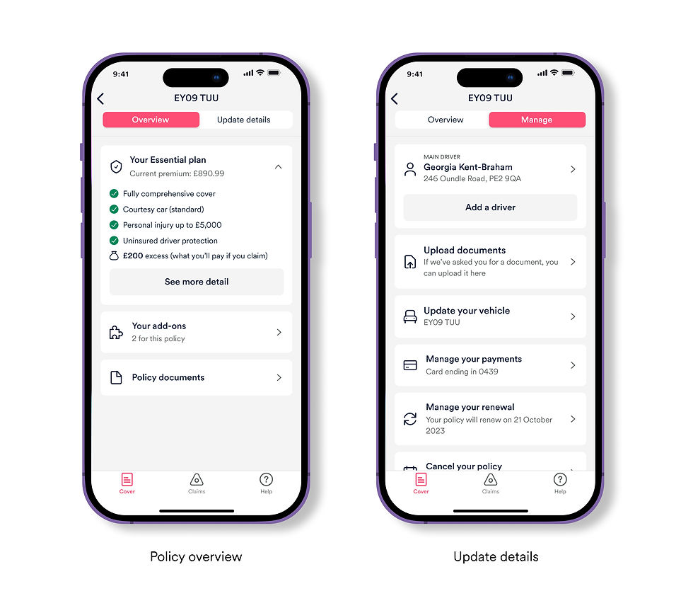
Manage policy
Grouping themed information and utilising progressive disclosure to reduce the length of the page by 200%+. Reducing this area to two tabs and improving heading content to be explicit to users on what they can find.
Impact
-
Reduction in queries to agents by 9.3% for miscellaneous questions in locating information
-
Increase in customers updating their vehicle and home address by 10.4% (Improving accuracy of user profiles)
Help & Support
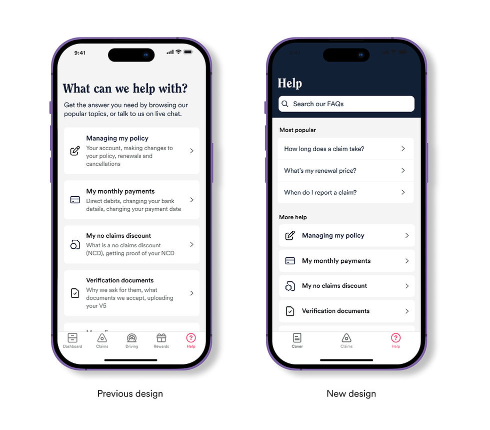
Help area
Improvements include updating the categorisation of existing FAQs, introducing a keyword search to locate articles. As well as recording article effectiveness to track areas in need of development.
Impact
-
Weekly FAQs viewed in app increased by 13%
-
Reduction in weekly live chats started through the app by 10% (120+)
-
An average of 75 article rating responses recorded a week to help understand what FAQs to optimise
Building feedback loops
We observed that a lot of customers would share requests and feedback to our cops team that would rarely pass its way down to the product squads in a structured format. We built out a new intercept feedback feature to help with this:
-
To begin to analyse the sentiment to identify any themes we could start addressing
-
To prompt users to give a rating on the play/app stores if they were having a positive experience
-
Our main KPI was around number of positive/negative reviews on the stores and trustpilot (App ratings increased from 4.6 - 4.8)

App store rating
Qualitative feedback
Key learnings
Preventing scope creep
It was important to understand what features were upcoming and needed to be accommodated within the app to set the initial strategy. However it was challenge for tech spikes to be done across all features due to the smaller size of the team. Running these earlier could have led to reducing overall time spent on the help feature as an example due to legacy code and detailed testing needed.
Design vision and impact
It had been challenging to get buy in from senior leadership for time to be allocated for general improvements in the app as mentioned above in the navigation, policy and help areas. By sharing the design vision and impact the changes would have on reducing queries to agents. Helped build a compelling rationale for the benefits of focusing on these projects.
Technical limitations
We had an shortage of back end engineers for long periods in the mobile team so we had to look for FE initiatives to work on until that resource was available. Working with engineers early to help build out a suitable roadmap that would not have any dependencies was key to releasing continual iterations